
ADM Design System — From Zero to a Scalable UI Platform
Understanding the project landscape
Why ADM needed a system
Before the system, product teams at ADM worked in silos. Patterns were duplicated, visuals drifted, and specs varied by team. Delivery slowed because each project rebuilt the basics—buttons, inputs, modals, tables—again and again. We needed one source of truth: shared tokens, reusable components, and documentation that made good decisions obvious and repeatable.
Research and discovery phase
Audit → align → accelerate
Initial design exploration
Bootstrap the system, fast—without cutting corners
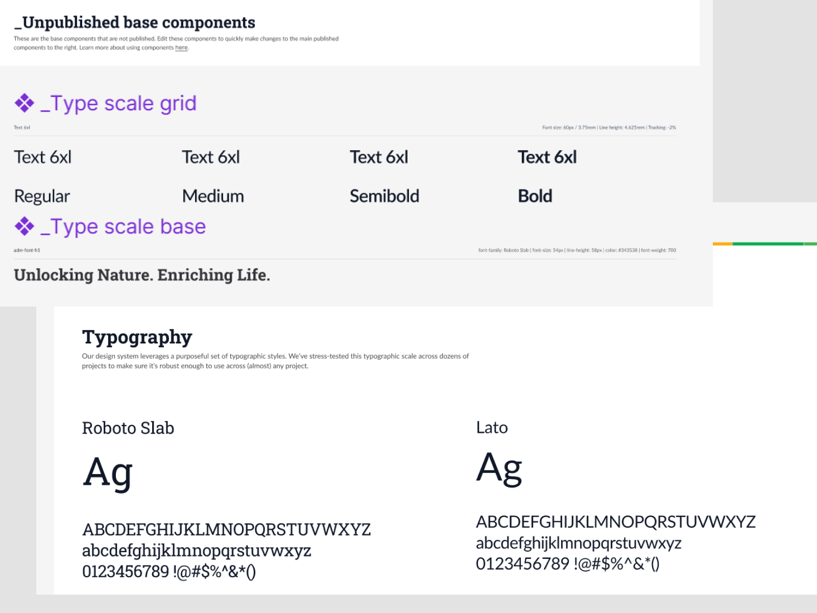
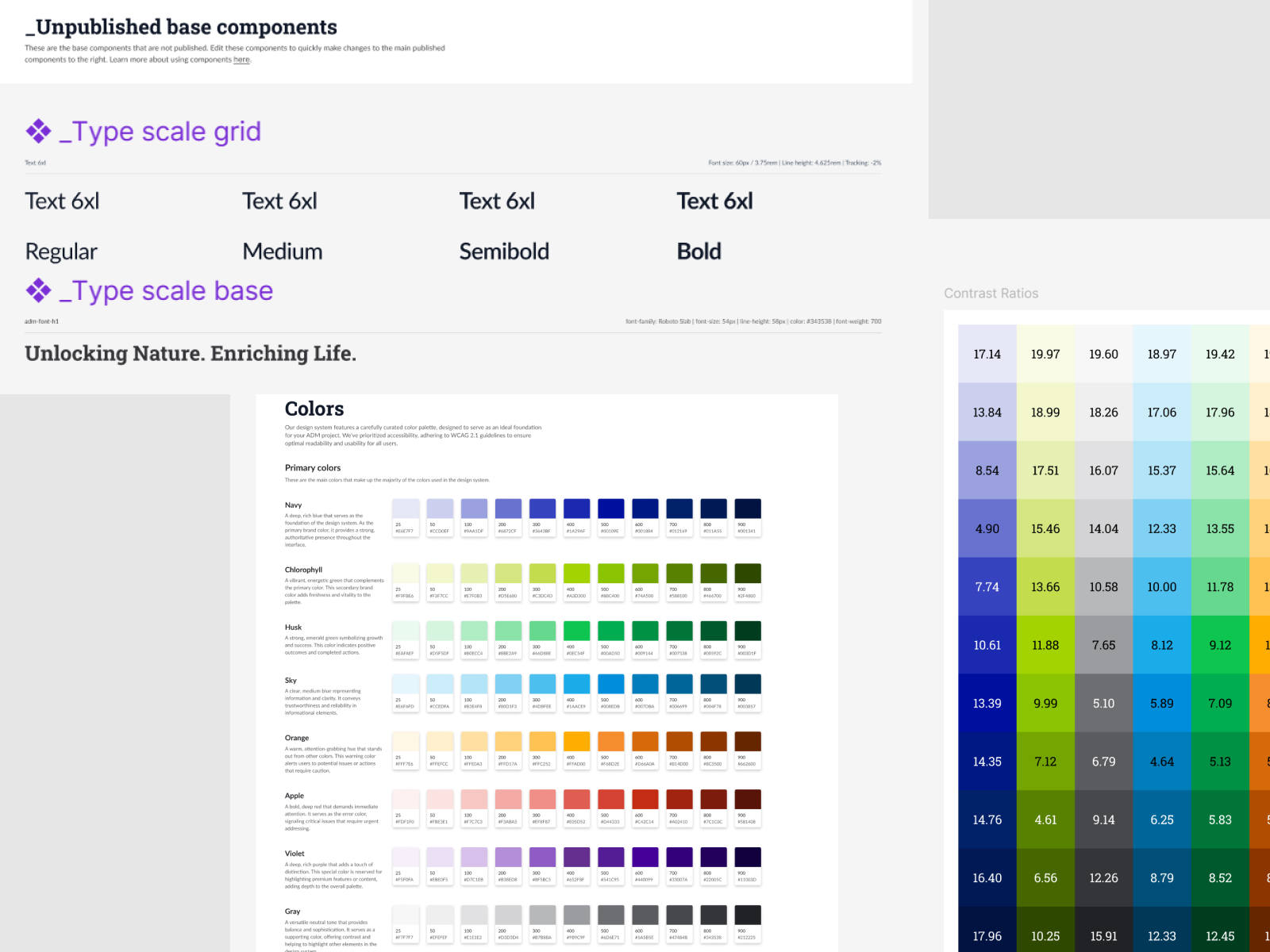
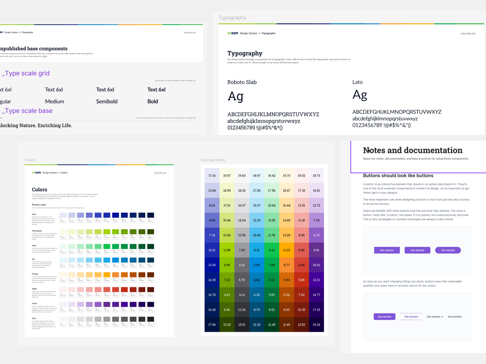
We stood up a tokens-first architecture (color, type, spacing, radii, elevation), mapped Untitled UI primitives into ADM brand, and created base components for common cases (buttons, inputs, selects, alerts). Documentation shipped with usage guidance and do/don’t examples so teams had clarity on day one.
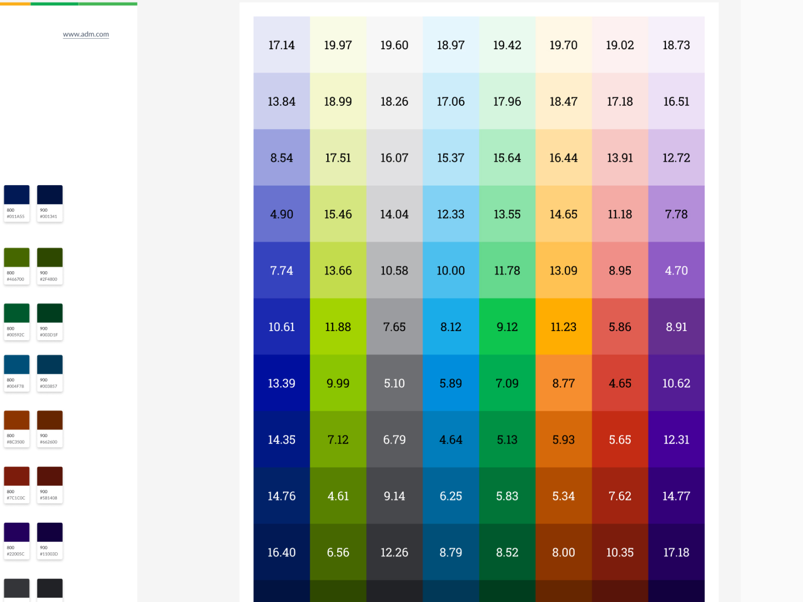
- Foundations: Color scale + contrast matrices, type scale, spacing grid, shadow/elevation rules.
- Base components: Buttons, inputs, text fields, selects, checkboxes, radios, toggles.
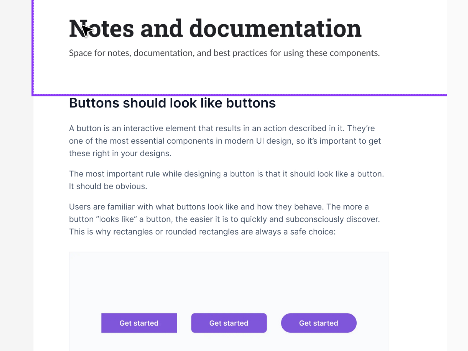
- Docs: “Buttons should look like buttons” best-practice notes, interaction recipes, and naming conventions.
Refining the design approach
From kit to platform
After foundations, we expanded into complex components and patterns (tables, filters, pagination, empty states, banners, wizards). We versioned everything and added changelogs, migration notes, and a request → review → publish pipeline.
- Versioning: Semantic releases (e.g., 2.0 → 2.1) with migration guidance.
- Theming: Light/Dark tokens + high-contrast variants.
- Dev parity: Figma specs mirrored in code with properties/variants mapped 1:1.
- Quality gates: A11y checks, design review, and token tests before publishing.
Final design deliverables and key features
What ships with v2.1
Project impact and user feedback
Outcomes across products
The system turned design from a project-by-project craft into a product platform.
• Reusable components reduced duplicate work and UI drift across teams
• Faster delivery from shared tokens and ready-to-use patterns (smoother handoff, fewer re-reviews)
• Consistency + accessibility: AA contrast baked into tokens and states
• Adoption across apps including Chat ADM; teams cite clearer specs and predictable behavior
• Roadmap:v2.1 live; v3 in development with a visual refresh, 2000+ components and project redesigns aligned to the new version
Explore more design work
Interested in seeing how design can transform digital experiences? Check out more case studies showcasing innovative UX solutions
