
Fur Babies – Pet Adoption Reimagined
• Problem: Mobile shoppers struggled to evaluate products and finish checkout.
• Role: UX audit, journey mapping, responsive redesign, prototype validation.
• Constraints: Third-party cart and limited theme changes.
• Outcome: Clearer PDP, tighter checkout, and smoother mobile paths that supported purchase decisions.
Understanding the project landscape
Why adoption feels too transactional
Most adoption sites bury emotion beneath cluttered lists and cold UI. We set out to design a heart-forward experience that reduces friction and builds trust between adopters and shelters—so the journey feels like bringing a friend home, not completing a form.
Research and discovery phase
Lead with love, validate with research

Initial design exploration
Make connection effortless
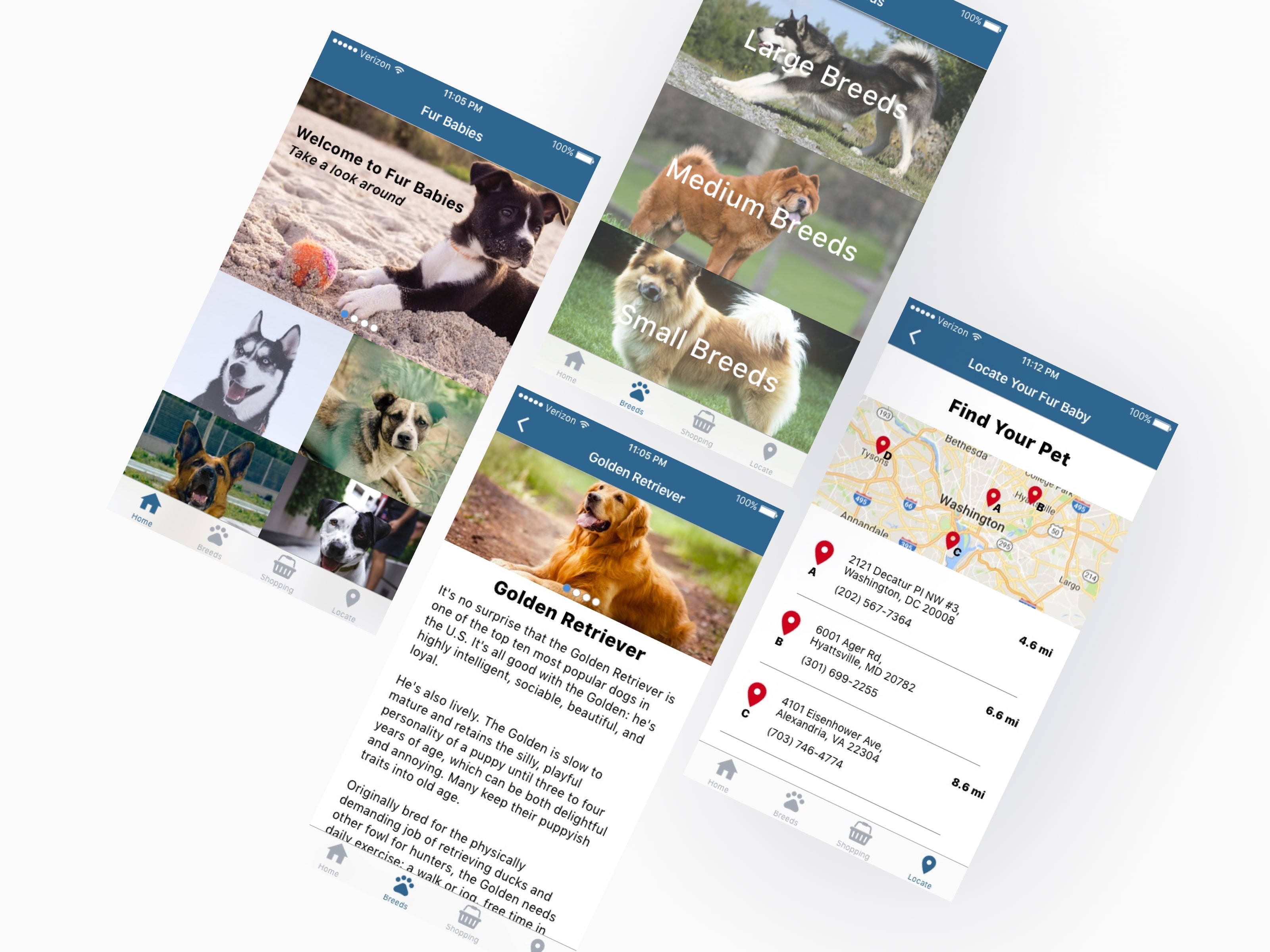
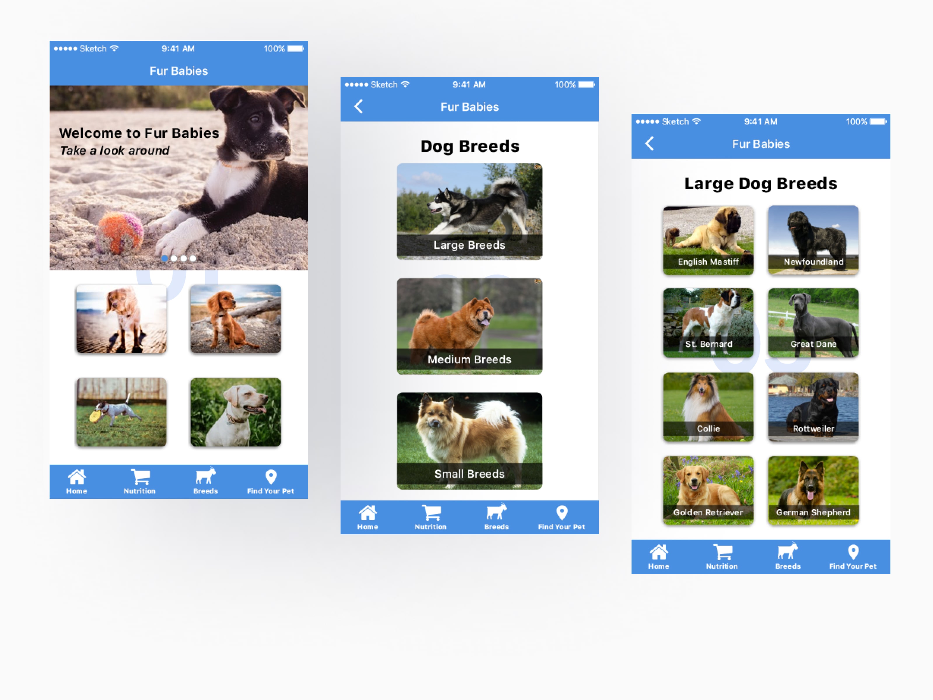
Early wires prioritized emotional clarity over dense grids. We tested a bottom nav and large, image-first cards to reduce cognitive load.
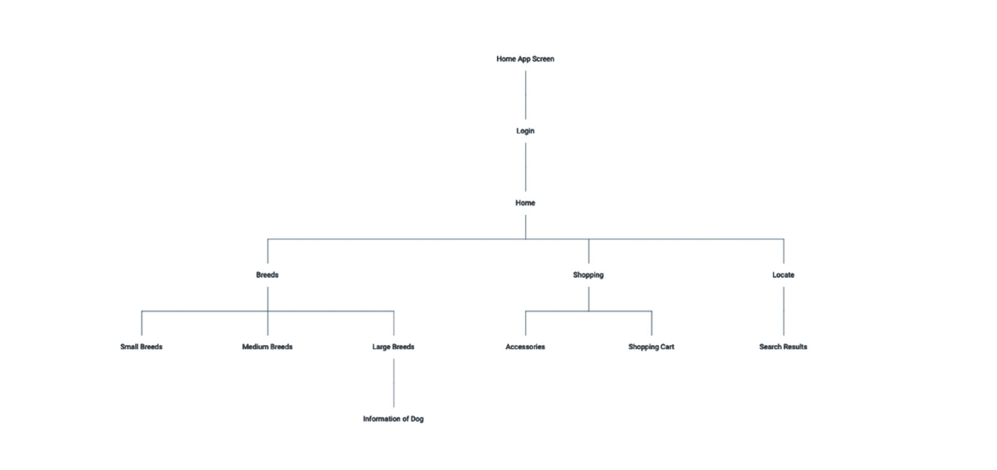
- Navigation: Simple bottom tabs — Shop, Breeds, Locate.
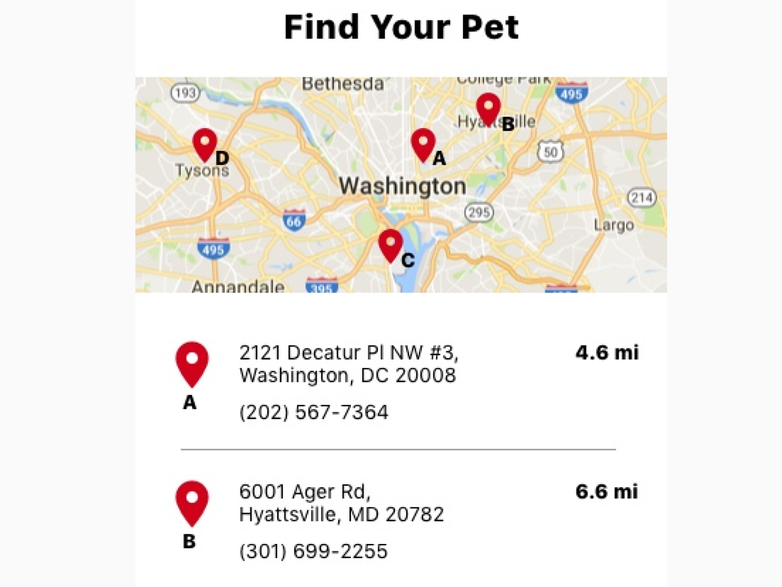
- Find Your Pet: Interactive map to nearby shelters for local context.
- Tone & palette: Soft blue-gray to lower decision stress.
- Content model: Pet story first, details on demand.
Refining the design approach
Storytelling as a UX system
Iterations focused on speed, clarity, and moments of delight—without sacrificing accessibility.
- Interactive profiles with personality highlights and clear next steps.
- Progressive disclosure for details after a breed/pet is selected.
- Performance polish: Faster image loading + tighter hierarchy.
Final design deliverables and key features
Soluion Highlights
- Compact image gallery with obvious zoom and variant selection
- Trust elements placed near price and add to cart so confidence is built where it matters
- Checkout broken into clear steps with progress, error recovery, and guest options
- Performance checks to keep pages fast and stable on average devices

Project impact and user feedback
Impact beyond launch status
- Test users evaluated products with fewer questions and moved to cart with less hesitation
- Observed checkout flows had fewer restarts and backtracks
- Merch and dev teams gained a shared, documented baseline for future iterations
Explore more design work
Interested in seeing how design can transform digital experiences? Check out more case studies showcasing innovative UX solutions
